Candle Label Redesign
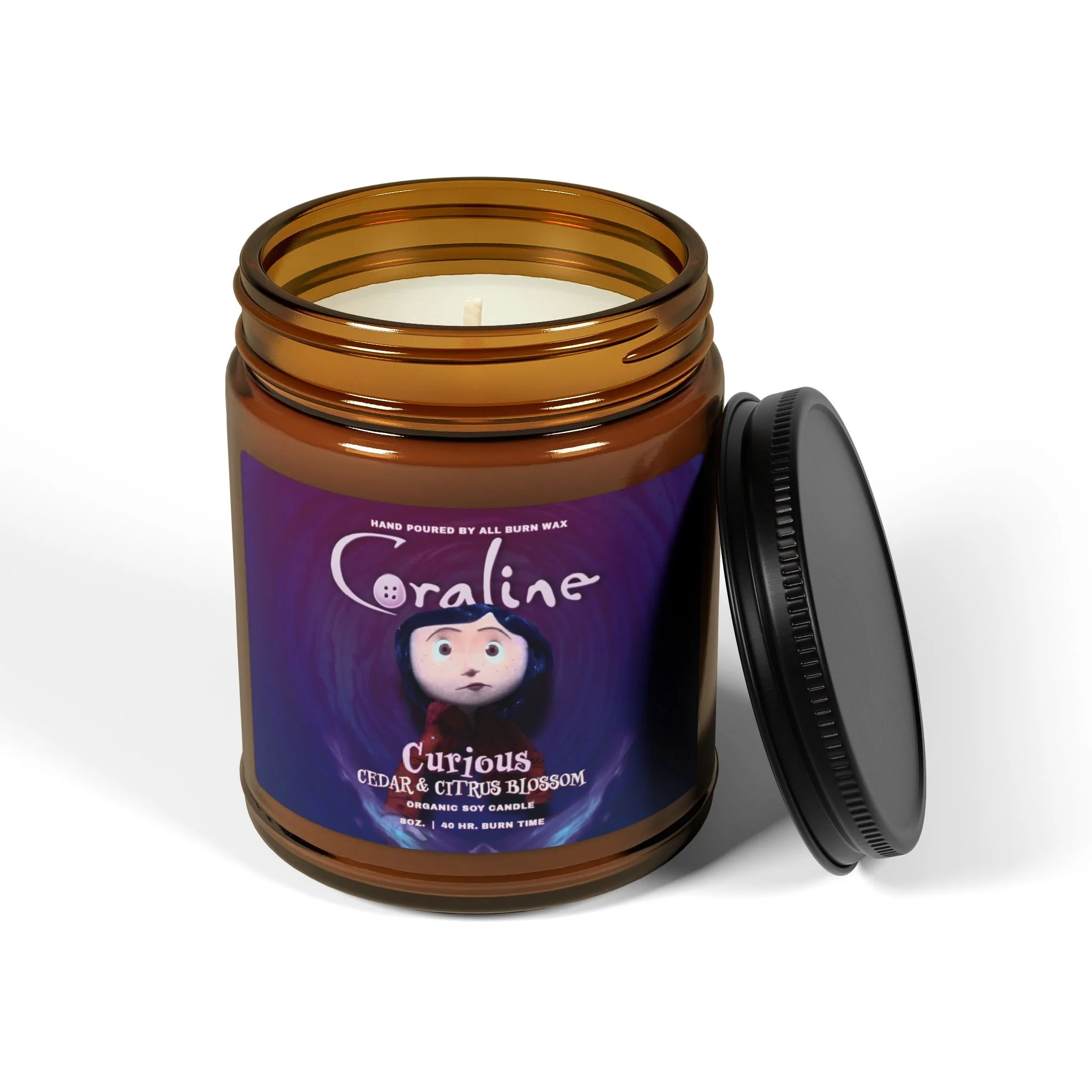
A bit of daylight savings brain fog this morning, but I still managed to get my practice in! Today's project was a candle label redesign inspired by one of my favorite films. There's absolutely nothing wrong with the original design; I simply wanted to explore alternative layouts and aesthetics. This one took me an hour to complete the design and about 30 more minutes to create some mock ups. I even recorded a quick process video showing how I arrived at my final design this morning. To reiterate, the original label is excellent and I understand its appeal, but I was curious to see what I could create.
BEFORE

I might come back to this design in a few weeks, after some more practice. But I think it really captures the movie's feel, with a slightly moodier, yet similar, color palette to the original. I even used a font finder to grab the subheading font from a movie poster. I could've spent hours tweaking the size, balance, and focus, but I've set time limits for myself, so I'm calling it good here!
VIDEO
As you spotted in the video, lunchtime hit and I just had to dive back into the design for some more tweaks. Here are my three design remixes, showing you the wild ride from my first draft to the final piece.
VERSION ONE

VERSION TWO

VERSION THREE